Here are five projects we are quite proud of from 2018.
People often ask, how many projects do you do in a typical year? This year we designed over 100 projects for organizations in health and well-being, financial services, higher education, and nonprofits. What’s our favorite? That’s hard to say. When Sir Paul McCartney is asked what his favorite album is he says it’s the one he is working on right now. That’s how we feel about our work. Yet some projects do leave a long-lasting sense of accomplishment.
Top health and well-being project
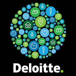
Deloitte Journey Videos
Building a healthy workforce is one of the core values for Deloitte, a company frequently honored for workplace excellence including winner of Best Place to Work from Inc. magazine. We designed 8 videos that address the needs of employees from their perspective by telling stories that start with real life experiences and demonstrate how Deloitte’s well-being programs address needs and provide support during life-changing events.
Top community building event
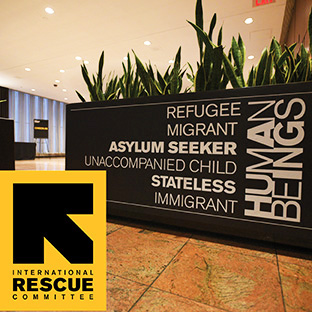
Rescue Dinner
The International Rescue Committee responds to the world’s worst humanitarian crises and helps people whose lives and livelihoods are shattered by conflict and disaster to survive, recover, and gain control of their future. The annual Rescue Dinner is their signature fundraising event of the year. We created a theme that expresses how we’re all in this together: Images of refugees, immigrants, unaccompanied children and stateless people are shown to be human beings. Table centerpieces featured images of people and a mirror so supporters can see themselves as part of the solution. We designed invitations, programs, a video and onsite graphics that transformed the New York Hilton from a vanilla meeting space to a dynamic space that supports the refugees of the world.
Top higher education campaign
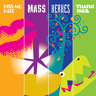
Arizona State University
Arizona State University produces professional theater and opera but often felt their work was not getting the level of respect and attention it deserved from audiences beyond the campus. We designed a poster system for communication that is produced in print, online and in social media campaigns. The dynamic graphics we developed were included in video promotions and the typography we created for Leonard Bernstein’s “Mass” was actually used on stage in the production! Check out the campaign here.
Top design for royalty
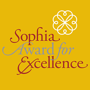
Queen Sofía Spanish Institute
The Queen of Spain came to New York City and we had the honor of designing the invitation and programs for Her Royal Highness! We were inspired by the colors of the Spanish flag and created a classic typographic treatment to reflect the elegance of the event.
Top annual report for a cause
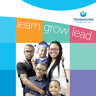
Children’s Aid
For the second year in a row we designed an award-winning report for Children’s Aid—a coffee table sized book celebrating the work of one of NYC’s most respected nonprofits. To measure the success of their programs, the Annual Report presents real-life issues through profiles of three CA recipients. The reports have won The American Graphic Design Award and The Communicator Award. Children’s Aid provides comprehensive services that support children in health, education, and social well-being. Because the only real way to combat poverty is to address all of the factors that prevent children from succeeding. See more.
Back to Insights
