Sometimes, minor changes and adjustments can be made to a logo. We call that a logo “refresh.”
Change is difficult because people believe they will lose something of value. There is comfort in keeping things the way they are. Teachers notice that even when they do not assign seats, students tend to return to the same place each class. I like to remind clients embarking on a brand change that we all have an ingrained reluctance to change. Yet it’s important to embrace change if you want your brand to stay relevant, particularly in today’s digital world.
Sometimes, minor changes and adjustments can be made to a logo, yet still, preserve a heritage that is meaningful to an organization while positioning it for the future. We call that a logo “refresh.” In some cases the symbol is preserved and combined with stronger typography, in some the artwork is redrawn and simplified, and in others, new colors are introduced. The process tends to be more fluid and faster than creating a whole new logo since you are building upon an existing identity and not starting from a blank slate.
When the refreshed logo is completed, a new brand guidebook is created with guidelines for typography, color, and sizing that establishes a standard that may be easily managed inhouse and builds a consistent corporate identity that reflects professionalism, trust, and clear communications.
How to tell if your brand is a good candidate for a refresh
Here are a few indicators that your brand may be refreshed:
1. Readability The logo symbol is nice but the type is hard-to-read. In digital spaces where logos have to be seen on screen and in small sizes, readability and having a distinctly recognizable logo becomes more important.
2. Heritage One reason to consider a refresh is when your organization has a strong and proud history that you want to build upon. It’s important to maintain a connection with existing and older supporters who already connect to your organization through the logo.
3. Concept Is the idea behind your logo still meaningful and relevant today? If you have to keep explaining what your logo means then it may be that your logo is not working for you. On the other hand, if it’s a clarity issue, perhaps the symbol can be redrawn.
4. Lost in space When your logo is seen near other “competitor” logos it should stand out and make you feel proud.
When logos are a good candidate for a refresh, we start with a kickoff session with the key leaders to gain their insights as we develop the refinements. We have created these four precepts for logo design:
1. Clarity Is it clear what the symbol/organization is?
2. Improved digital reproduction How does the logo look in social media, web, and online usages where visibility can be challenging?
3. Typography This includes readability and appropriateness to the organization. We choose fonts that reflect the character of the organization.
4. Honoring tradition while moving forward It is important to balance the needs of existing audiences with the desire to connect to new audiences.
Here are some recent examples of effective logo refreshes.

The Russell Berrie Foundation was founded on fulfilling the philanthropic impulse of their founder. Their logo combines a butterfly with a heart in a beautiful icon that worked well in traditional stationery but was getting lost in digital applications on the website, social media, and on sponsorship pages. Ruth Salzman, CEO of the Russell Berrie Foundation said, “Our logo was easy to overlook when it appeared on digital sponsor pages.” Yet they were not looking for a radical change. “It’s like wearing a new pair of glasses.” It was important to maintain a connection to the original symbol with the right level of presence.
Ruth Salzman appreciated how well the process of redesigning their logo worked. “The initial listening session gleaned very good insights…and each iteration moved us forward.”
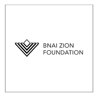
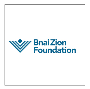
Bnai Zion Foundation has been supporting Israel for over 111 years—longer than Israel has existed as a state. Their logo was based on an abstract Menorah and was featured prominently on buildings like the Bnai Zion Medical Center in Israel. But, the organization is not as well known in The United States where the majority of the funding takes place. The nonprofit was committed to raising its profile and generating awareness among new audiences online, but the logo held them back. It was hard to reproduce in small sizes—especially on the website and in digital media. Visibility online became more important as the organization sought to reach new and younger audiences.
The Chairman of the Board did not want to stray too far from the symbol because of the deep emotional connection established between the organization and its supporters in Israel. Yet the symbol had some real problems. The artwork was dated. It was fussy and hard-to-reproduce. The typography was hard-to-read. It was not going to be an asset in its mission to grow its presence in the US.
We reimagined a logo that feels more current without throwing away the past. At the same time, we addressed the practical issues of readability to equip Bnai Zion with a logo that is easier to use.
A small change can have a big impact. Olstein Funds had a solid website (we should know—we designed the website and the logo over 15 years ago) but it was time to upgrade and become mobile-ready and responsive. Part of this upgrade involved switching to a bolder typeface from Google Fonts and giving the logo a minor facelift.
The concept behind the logo still resonates with the client and its key audience of savvy investment professionals. Olstein was known for its investigative approach of looking behind the numbers when analyzing potential investment opportunities.
Tim Ermi, Senior Vice President, Director of Business Development at Olstein Capital Management said, “It is important that the logo continues to feature a ‘magnifying glass’ to reflect Olstein’s investment approach yet we also wanted to meet the challenges of today’s digital world with a logo that feels forward-looking.” The change is simple, yet it makes Olstein feel more like a contemporary firm operating in today’s global economy.
Back to Insights


